Black Executive Men
An invitation-only membership platform for Black men in corporate leadership.
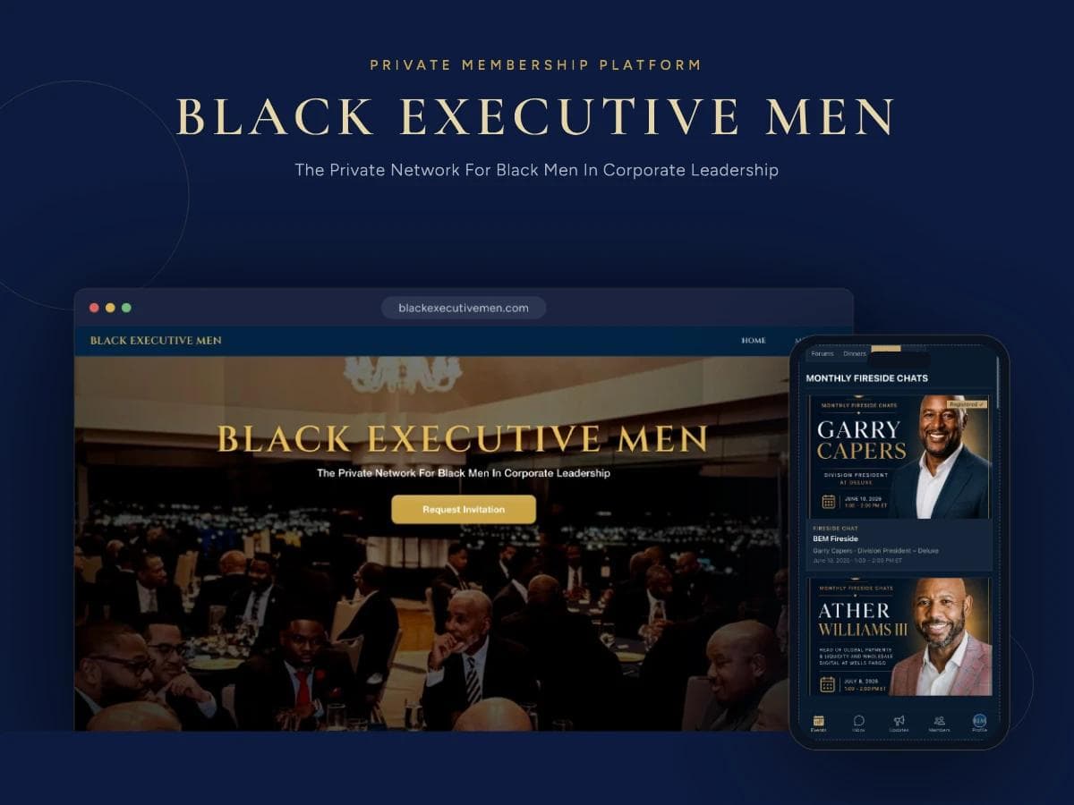
Black Executive Men is a private network, not a public website, so the build had to feel like walking into a members' club: exclusive on the outside, genuinely useful on the inside. I designed and developed the whole experience, a gated marketing site with an invitation-request flow, and behind it a members' area for events, monthly fireside chats, forums, dinners and a searchable member directory.
Invite-only
Access model
Members' area
Beyond a brochure site
Mobile-first
Built for phones
Client
Black Executive Men
Services
Technologies Used
 React
React Next.js
 TypeScript
 Node.js
 MongoDB
 Tailwind CSS
A private platform, not a brochure site
Everything public is a front door: a single, confident hero and one call to action, Request Invitation. Applications are captured, reviewed and approved before anyone reaches the network, so the membership stays curated and the experience stays exclusive.
Invitation flow
Prospective members apply, admins review and approve, access is granted only after that.
Gated members’ area
Everything behind the door, events, forums, directory, is authenticated and members-only.
Executive tone
Deep navy and gold, serif display type, generous space, a brand that reads as senior.
What members actually use
The network runs on its programming, so the members’ area is built around it. Monthly fireside chats with senior executives take the front page, each with speaker, role, date and a one-tap registration state, alongside dinners, forums and the people behind them.
Fireside chats & events
Speaker-led sessions with dates, details and registration, with a clear registered state.
Forums & dinners
Ongoing discussion threads and in-person dinners kept in one place.
Member directory
Profiles that make the network searchable, the reason members join in the first place.
Inbox & updates
Direct messaging and an announcements feed so the community stays connected between events.
Built for how executives browse
Members check in from their phones between meetings, so the members’ area is designed mobile-first, a bottom tab bar for Events, Inbox, Updates, Members and Profile, and cards that stay readable at a glance. The same components scale up to a full desktop layout without a second codebase.
App-like mobile UX
Persistent tab navigation and thumb-friendly cards, the phone is the primary device.
One responsive build
A shared component system covering mobile through desktop.
Interested in Similar Work?
Let's discuss how I can help bring your project to life with modern web technologies.
More Projects
Explore more of my recent work